Visualizing virtual collaboration styles with Lucid
Digital workplace software company Lucid was looking to secure media coverage with research commissioned around employee collaboration styles. As Highwire‘s creative lead, I set the creative direction, led UX design, and oversaw creative production for a multifaceted digital campaign that would become Lucid’s first annual The Way We Collaborate Report.
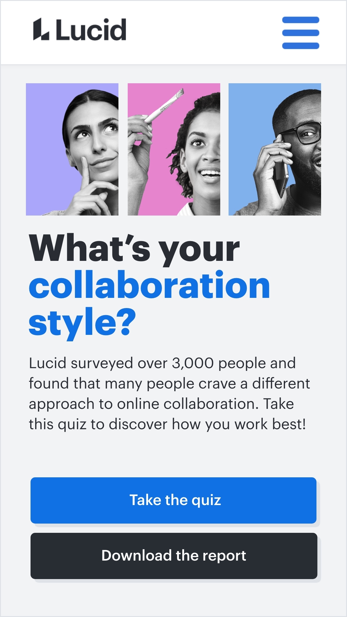
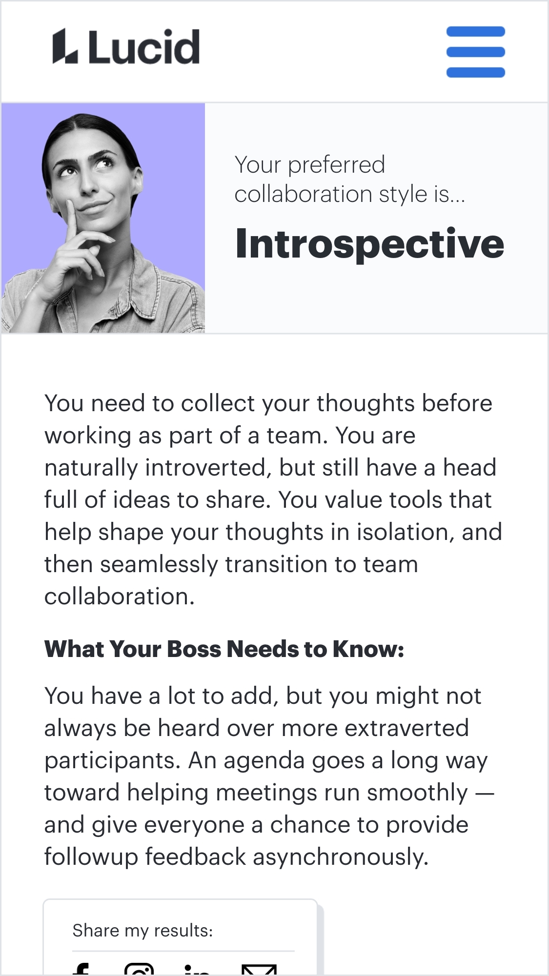
As the campaign centerpiece, we developed a mobile-friendly self-assessment tool that leads visitors through a series of questions designed to determine their collaboration styles.
Results are supplemented with personalized recommendations for tools and strategies that help each collaborator work best with others. The digital experience serves to both tease report themes and capture prospective client information through a lead generation form integrated into the quiz experience.
User experience design
To organize team efforts around a defined goal, I developed a site plan of low-fidelity wireframes mapping out two desired user journeys.
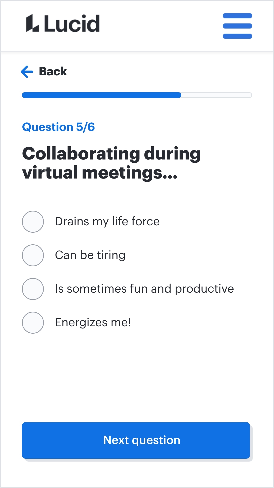
In order to keep our audience’s attention and usher them through the gate, it was important to keep the experience brief, entertaining, and easy to navigate.

The assessment tool site structure consists of:
- A splash page introducing the quiz and providing participants with the option to bypass the experience and go directly to the report gate (see the pink user journey above)
- Six multiple choice questions, with a progress bar displaying where participants are in the experience
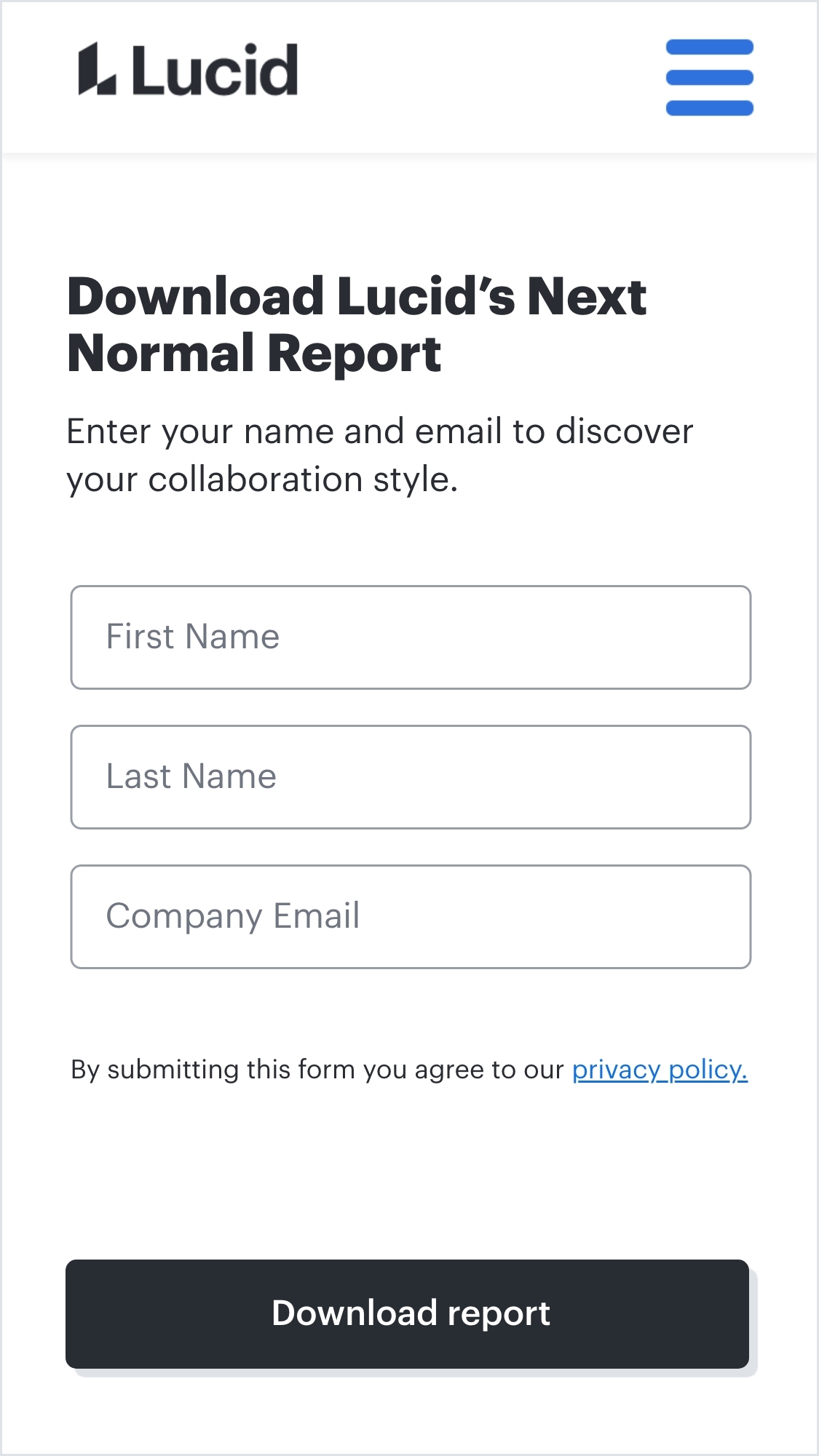
- A simple form designed to capture enough participant information to serve as a meaningful lead, without risking abandonment
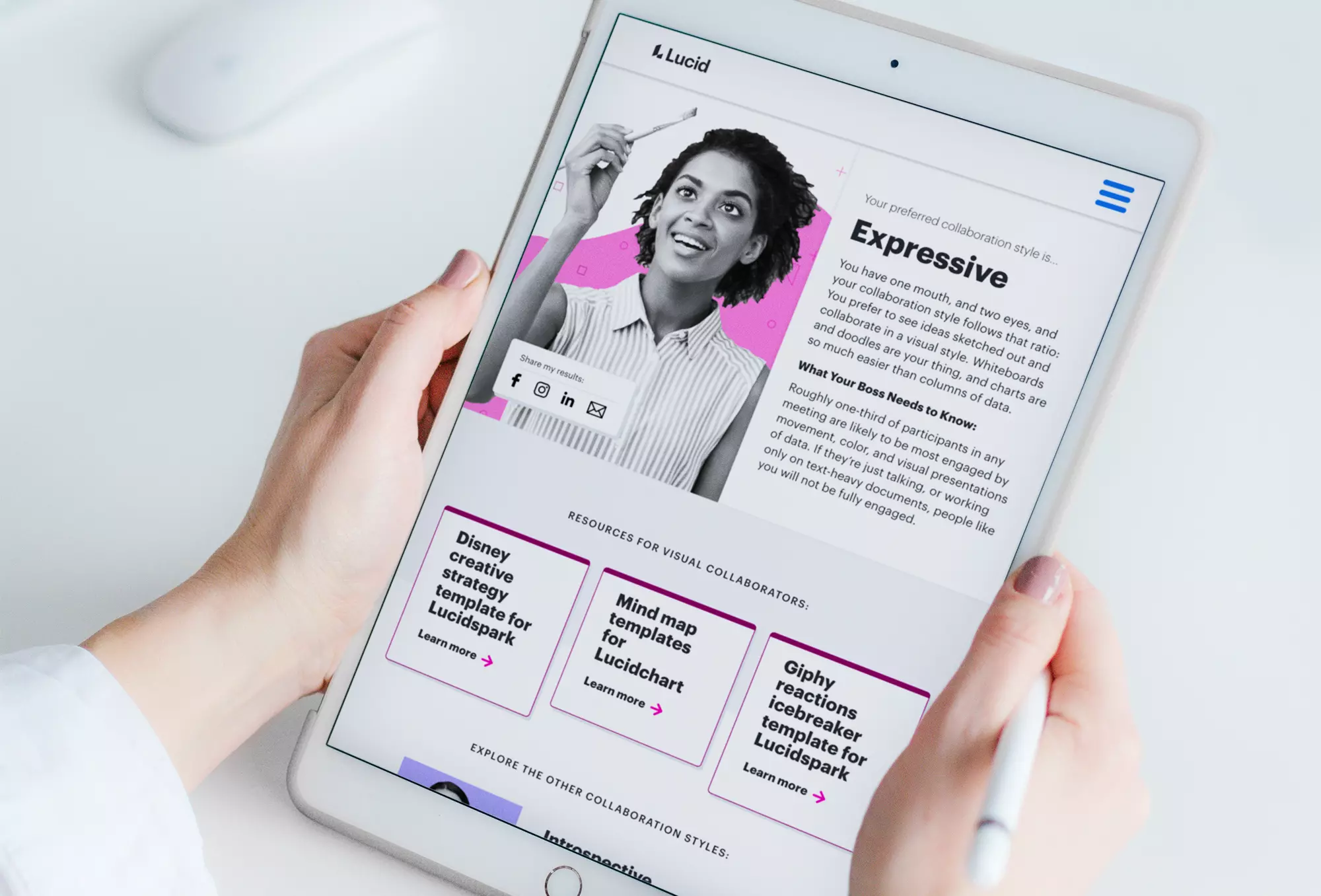
- A customized results page providing a brief overview of the participant’s collaboration style, links to Lucid tools designed to serve that collaboration style, an opportunity to explore the other collaboration types, and a final call to action to download the report or to learn more
Art direction
In parallel to the UX design, I led a small creative team through the process of crafting a visual identity that could unify the Way We Collaborate campaign.
Lucid’s primary visual brand is illustration-focused, with simple line illustrations that can be combined to create elaborate scenes of work life. Yet with collaboration personas at the center of this research, we knew wanted to present a visual strategy that felt more personal and put the human experience at the center of the campaign.
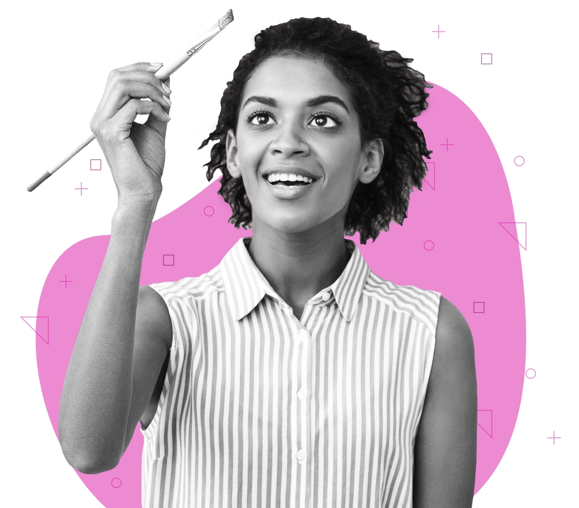
The final aesthetic combines black-and-white portraits that illustrate diverse collaborators with graphic elements native to Lucid’s general identity. The background shapes and line patterns that make up each composition serve to both abstractly depict the characteristics at the heart of each collaboration style and root the campaign in Lucid visual language.


Report design
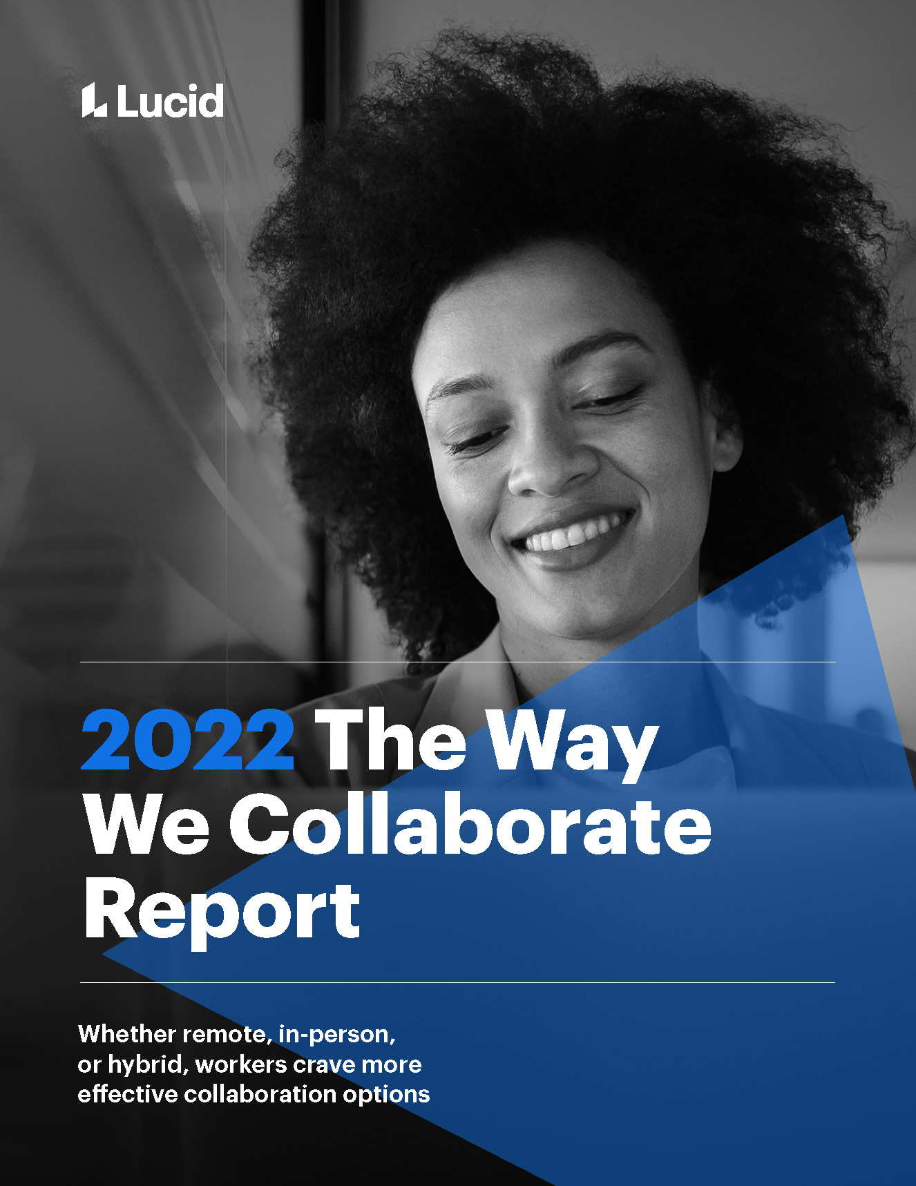
With the assessment tool in development, our design team shifted focus to the Way We Collaborate Report itself: a 30-page written document that showcases Lucid’s full collaboration research findings.
Our goal was to synthesize previous brand material examples into a cohesive document design system Lucid could build upon for future reports and white papers.
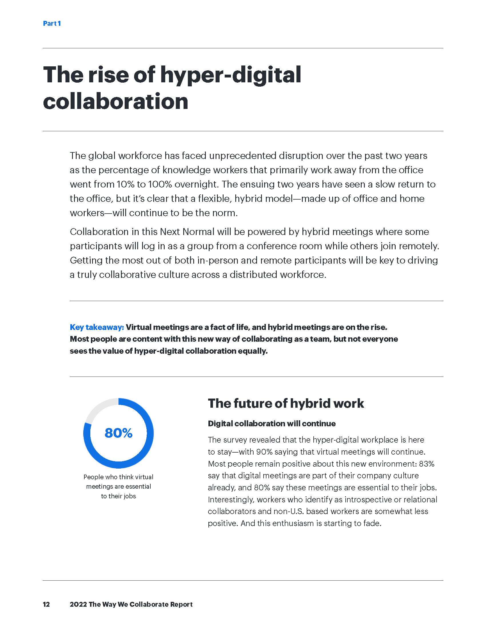
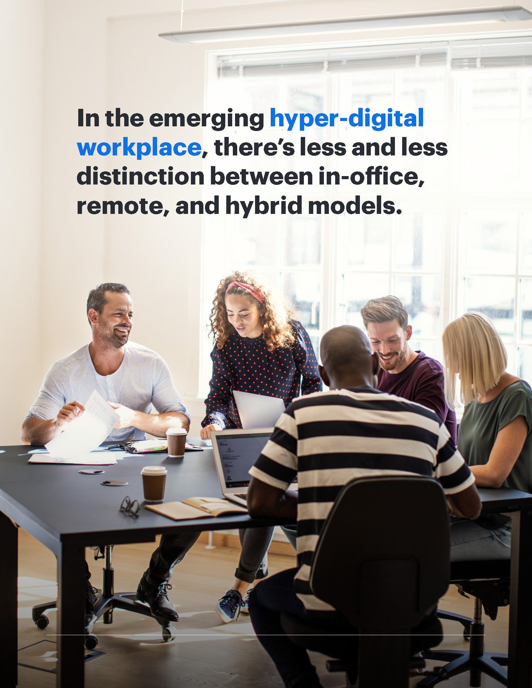
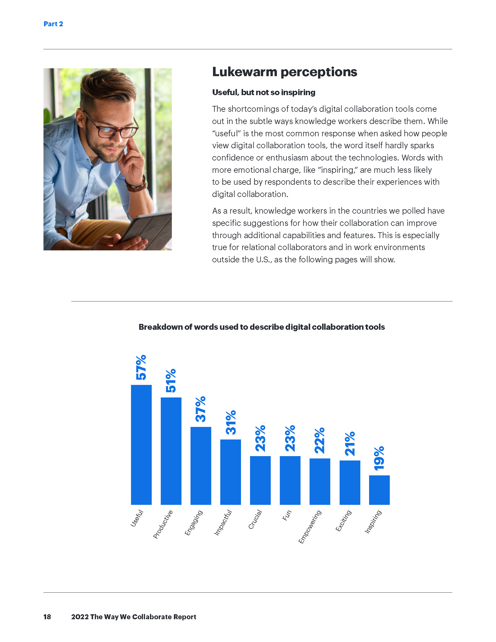
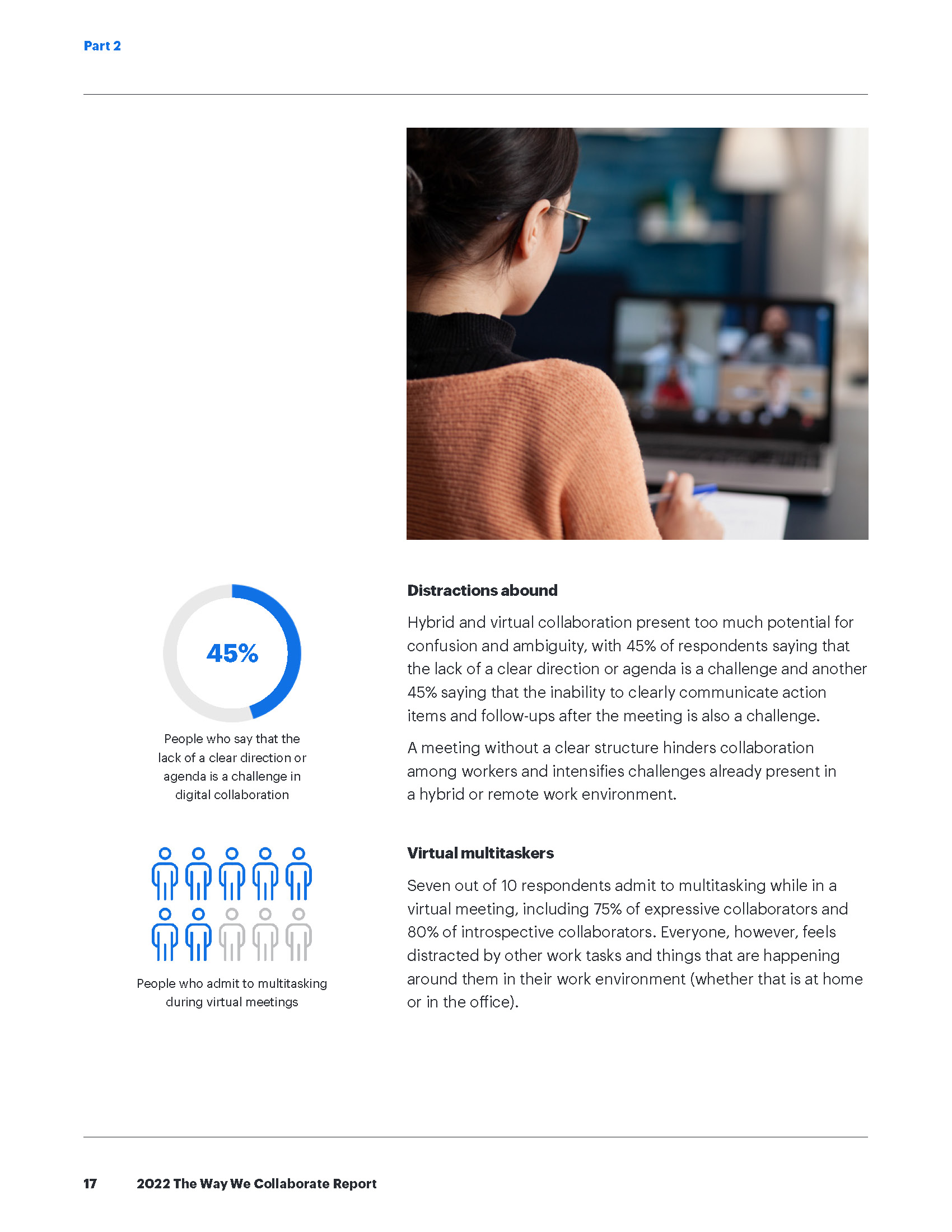
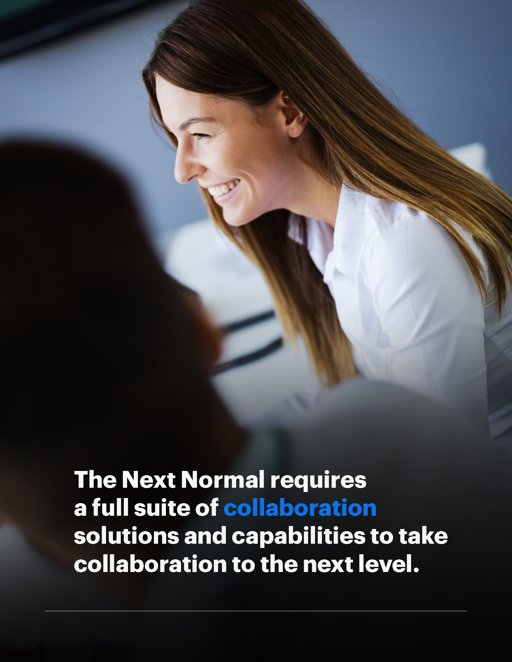
The resulting report combines data visualizations, full-bleed photography, and pull quotes in a flexible two-column layout. The editorial lead and I worked closely to ensure that the written text was supported with intuitive charts and graphs presented concisely and consistently.
Campaign assets
In addition to the digital assessment tool and report, the final campaign deliverables also included an infographic designed to preview the quiz experience to reporters and a suite of social media assets for organic and paid promotion.
Agency: Highwire PR
Client: Lucid
Client lead: Allie MacPherson
Design/creative lead: Sarah Dean
Report design support: Keith Simpson
Moodboards: Mark Ledgerwood
Developer: Dave Morreale
Editorial lead: Dylan Tweney
Editorial support: Rob Christie