Weaving local imagery into a French dental practice
Cabinet Dentaire des Savoies, a dental practice located in the Rhone-Alpes region of France, was constructing a new state-of-art clinic and needed a visual brand and signage system to match.
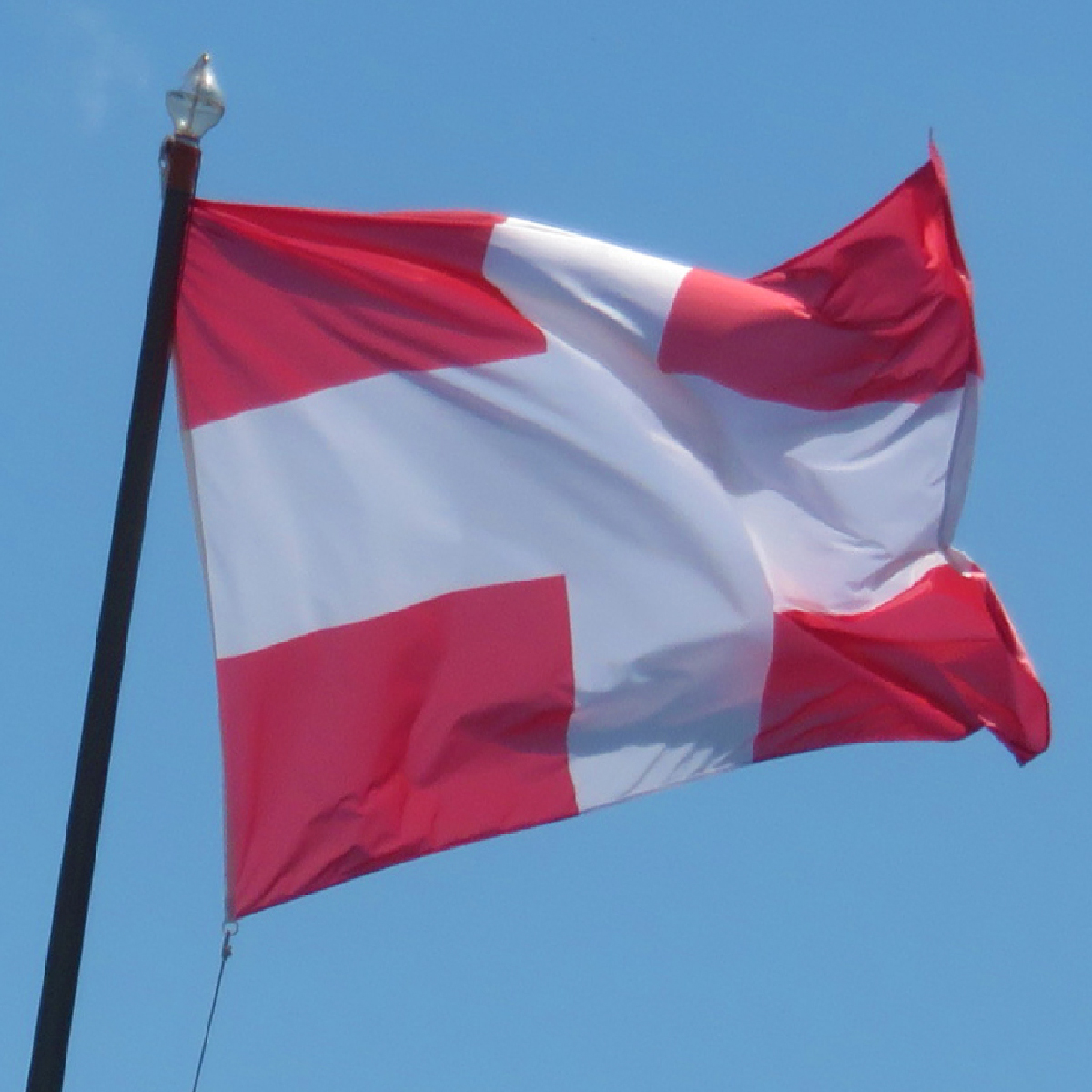
The client was proud of the Savoie region’s rich cultural identity, so it was important that the brand reflected local heritage. It also needed to complement the sleek office aesthetic proposed by their architecture firm, which centered around a living wall.
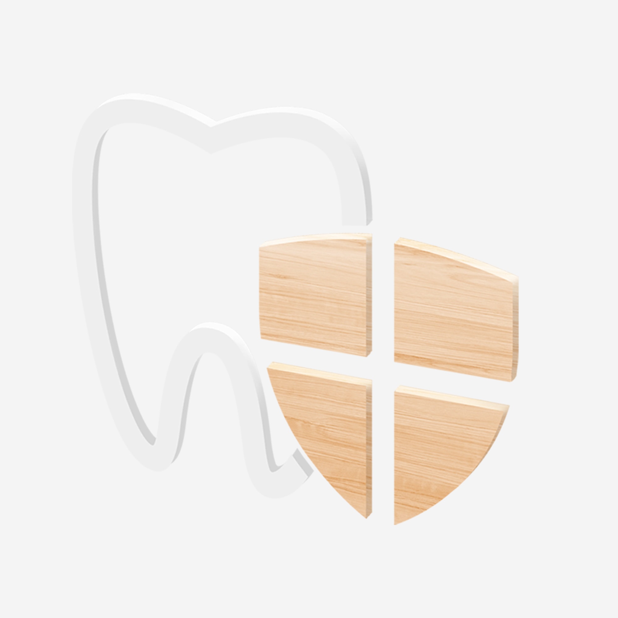
Cabinet Dentaire‘s new logo combines the universal symbol of dentistry – a tooth – with the cross-shaped emblem of Savoie, forming a modern icon that conveys the practice’s purpose and local pride.
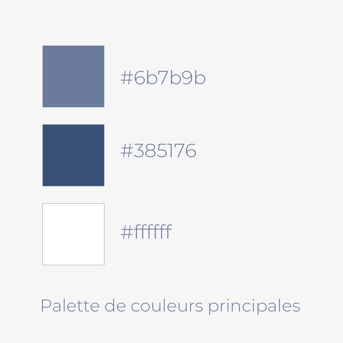
The deep gray-purple and bright white invoke the region’s mountain landscape, while rounded uppercase letterforms provide a friendly, solid foundation.
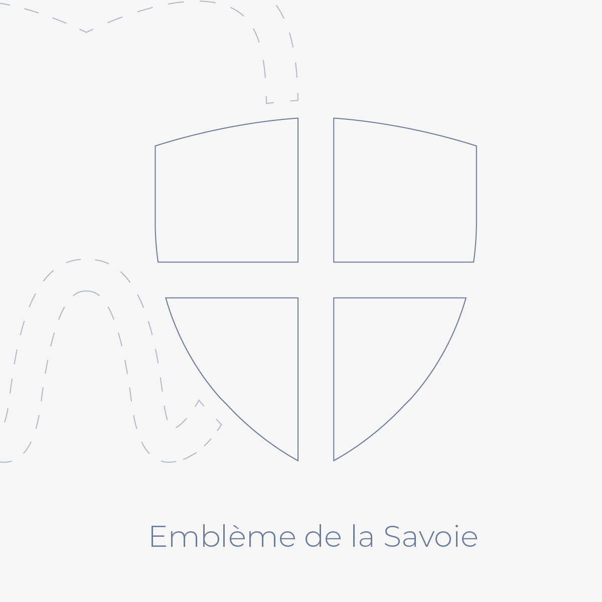
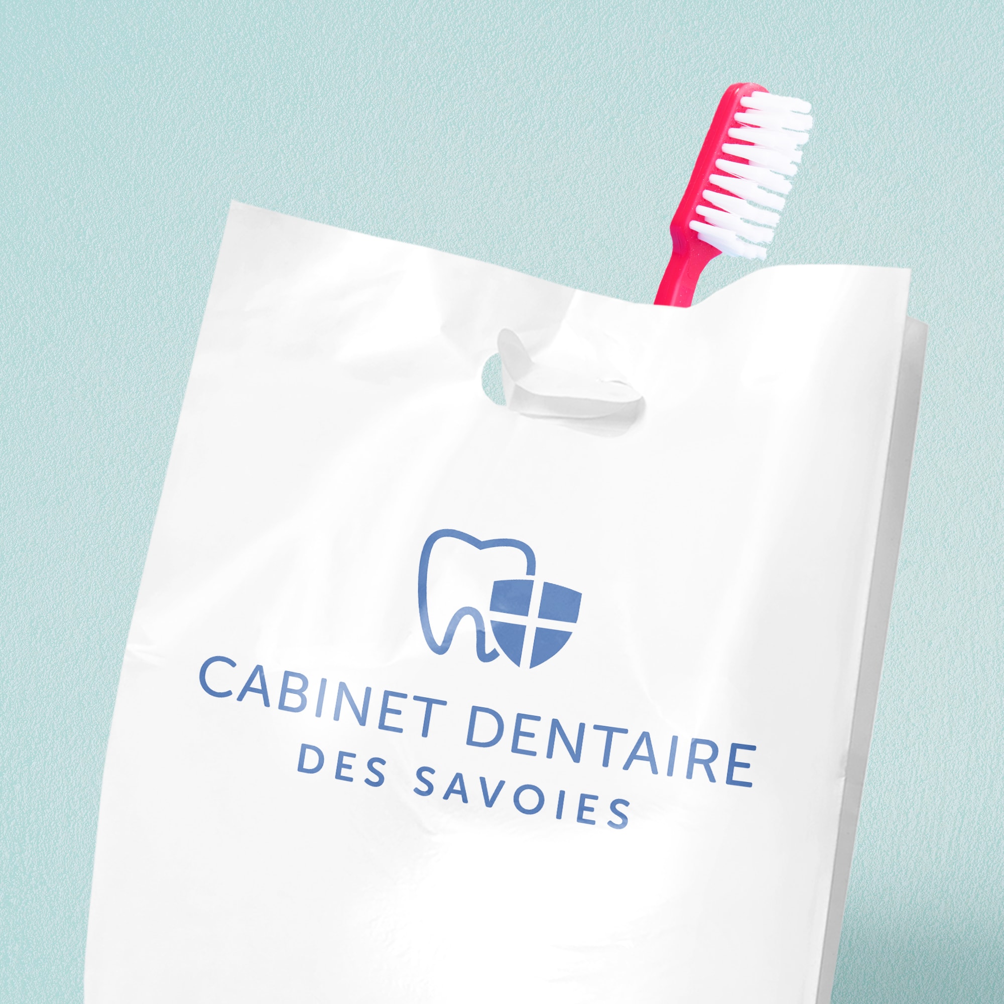
The logo is versatile, working well as a branding icon and as a physical interior design element. It reduces effectively for use on printed materials, such as plastic bags and dentists’ uniforms. Variations include a three-dimensional wooden cutout, designed for optimal visibility when suspended in front of the living plant wall.
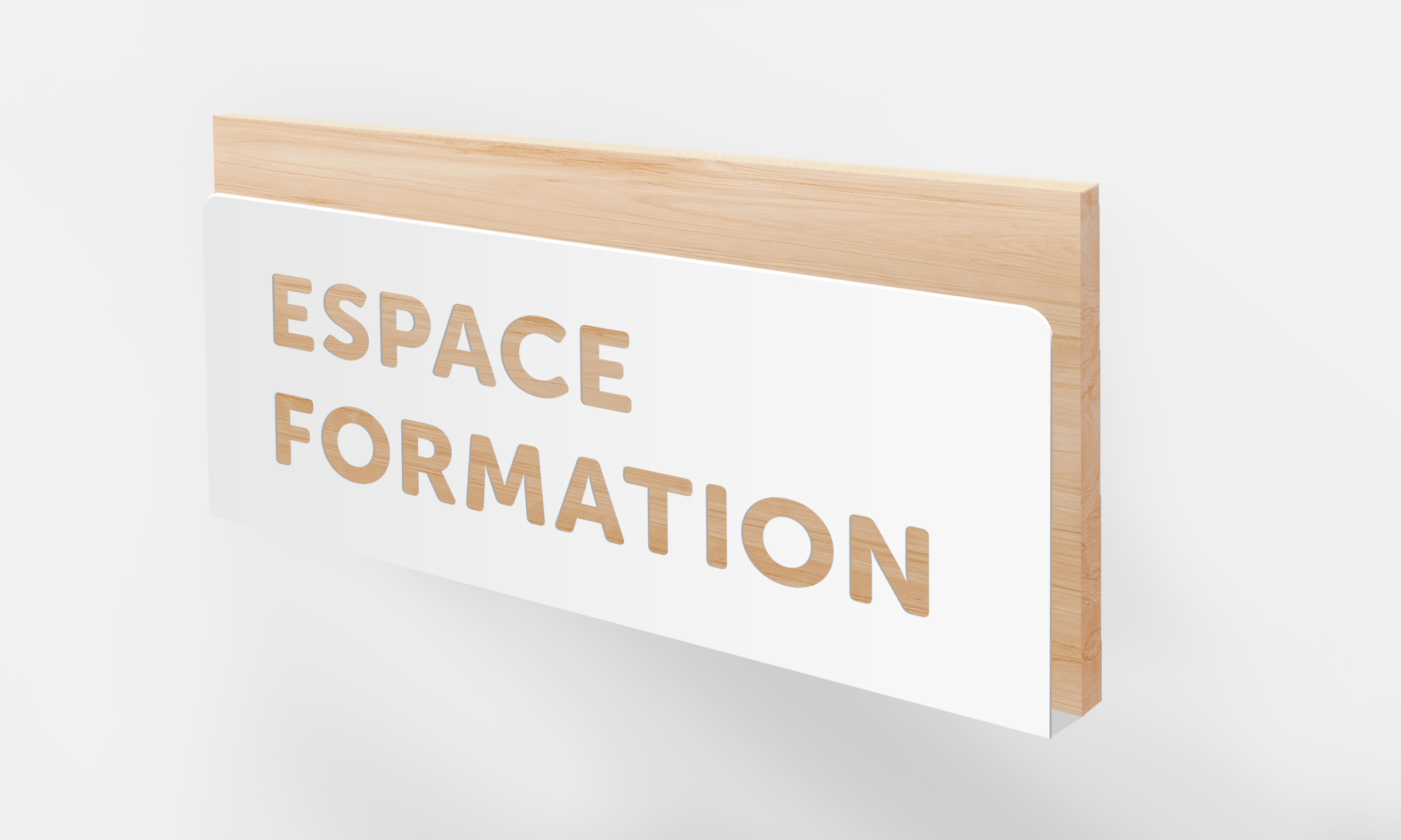
To extend the brand further into the physical space, I developed signage designs for 15+ different office areas, including treatment rooms, a waiting room, and bathrooms. The proposed design below – this example labeling a training room – ties together different aspects of the visual brand with a shared typeface and materials.
Agency: Freelance Project
Client: Cabinet Dentaire des Savoies
Design Lead: Sarah Dean