Building trust in a data security through modern design
Security software company Code42 were looking to elevate their visual identity with a fresh look-and-feel for their annual Data Exposure Report. As Highwire‘s design lead, I developed a minimalist report design system that helped position Code42 among the aspirational brands they strove to emulate.
Code42’s previous reports were designed in a densely-packed landscape format. The documents read more like branded decks than premium industry thought leadership. To achieve the sleek, modern aesthetic the Code42 brand team wanted to emulate, we recommended:
- Switching to a portrait page orientation
- Increasing text size/style contrast to improve the visual hierarchy
- Establishing a limited color palette (blue + an orange gradient)
- Maintaining ample whitespace to allow layouts to breathe
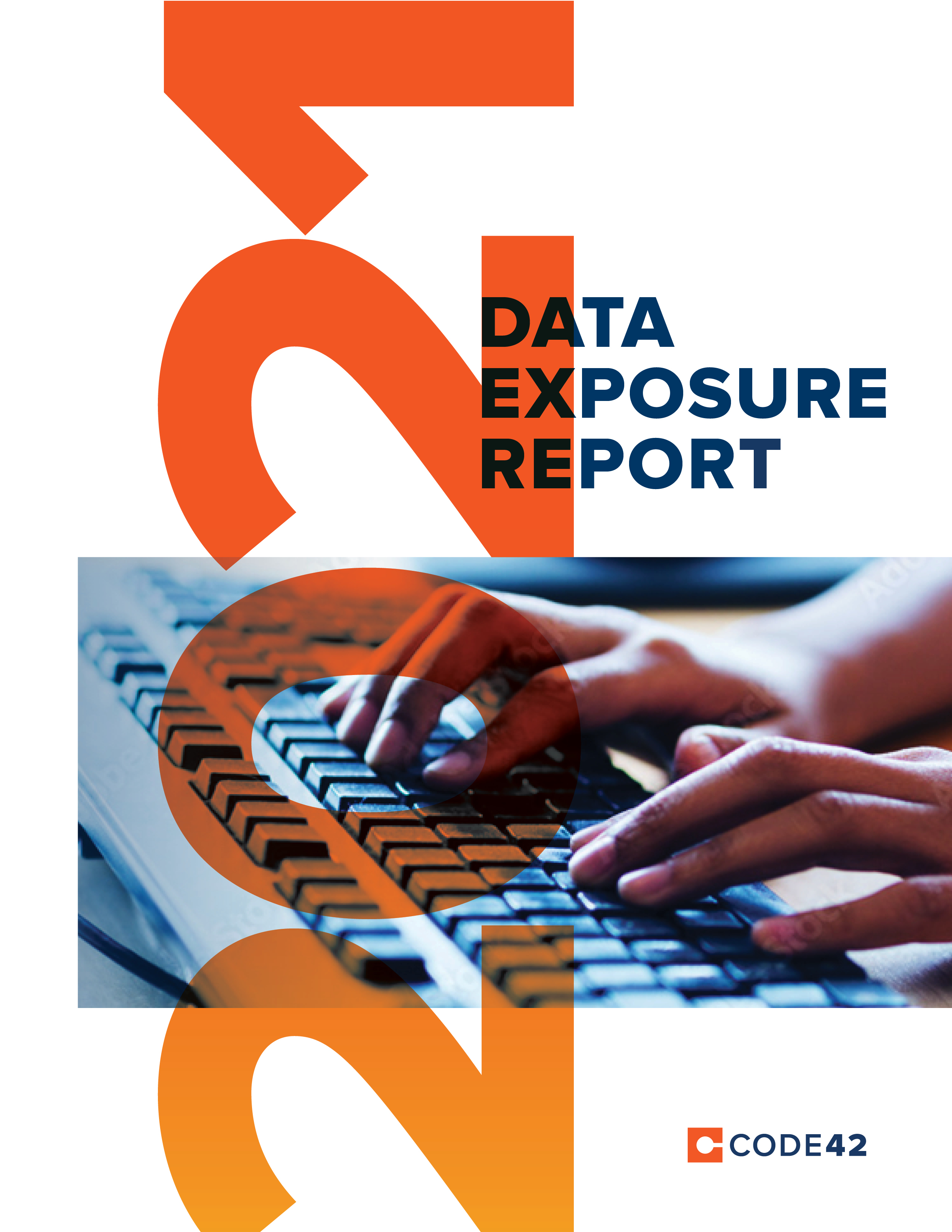
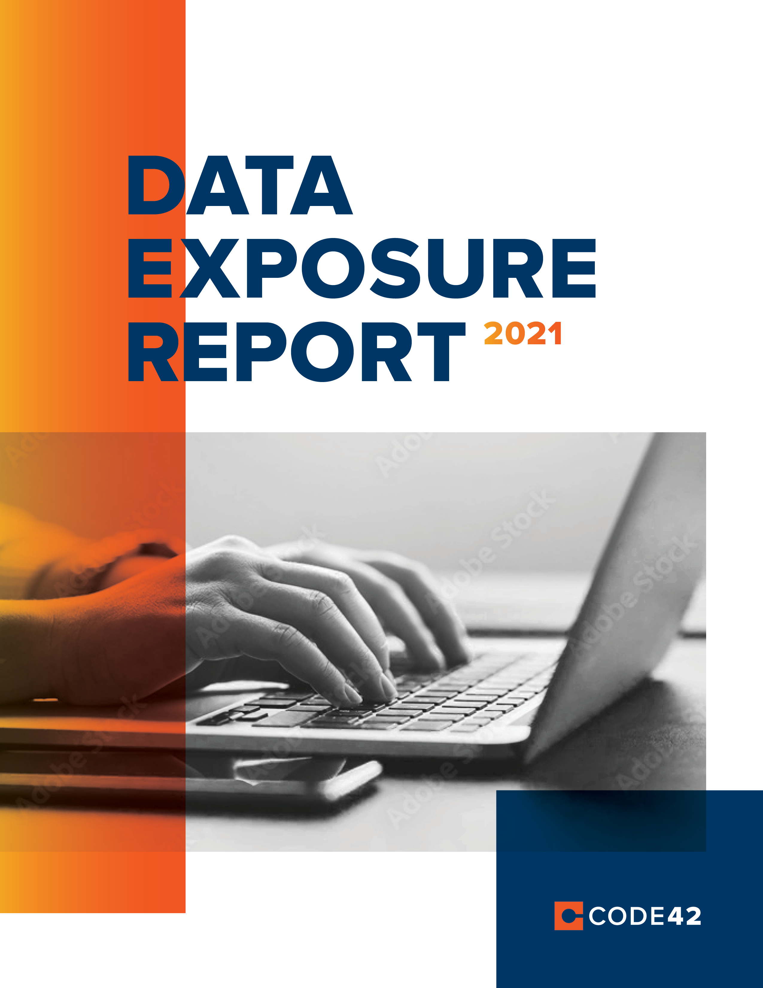
For the report cover, we experimented with blend modes over text and images to play up the “exposure” element of the report title.
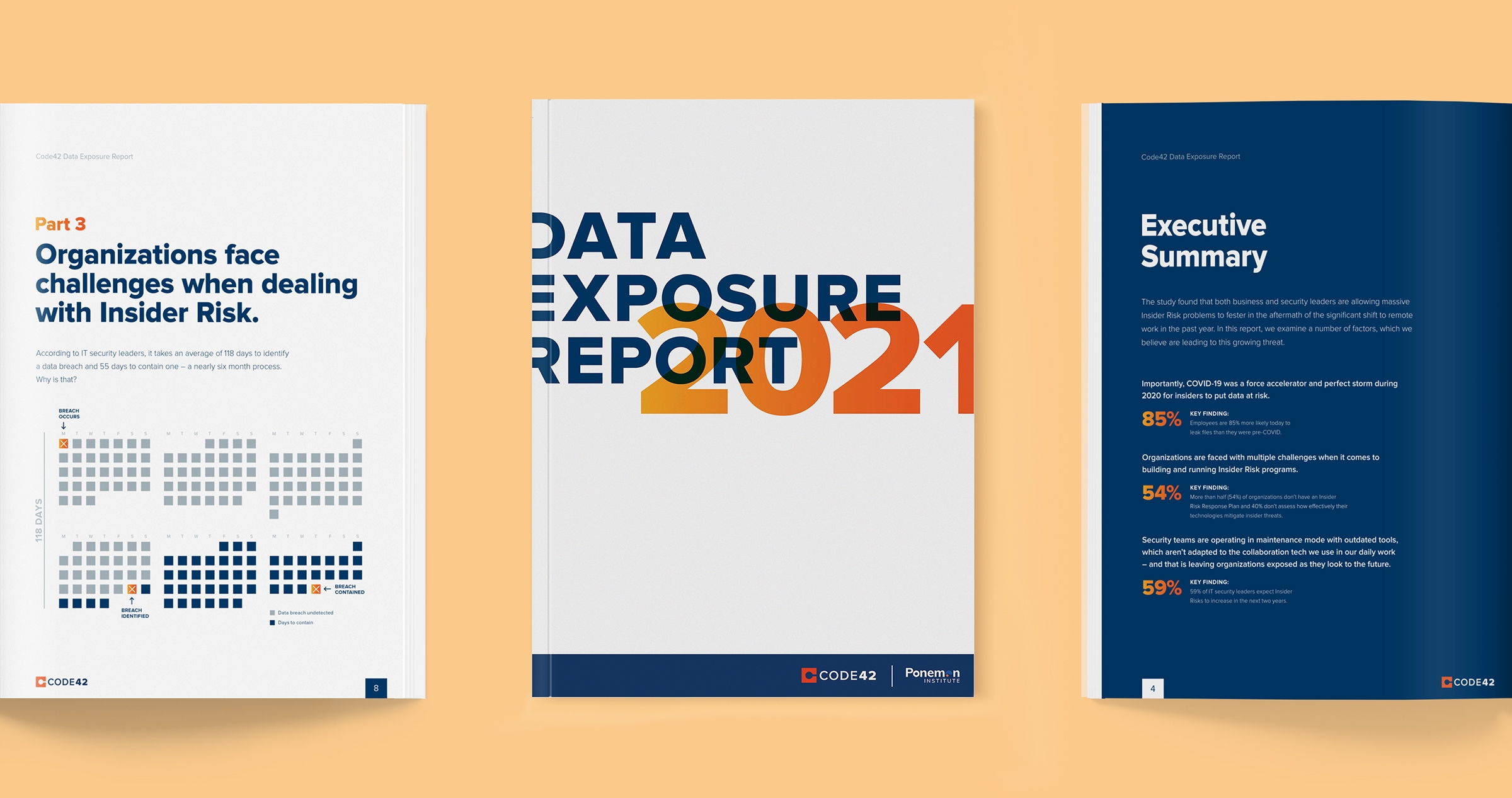
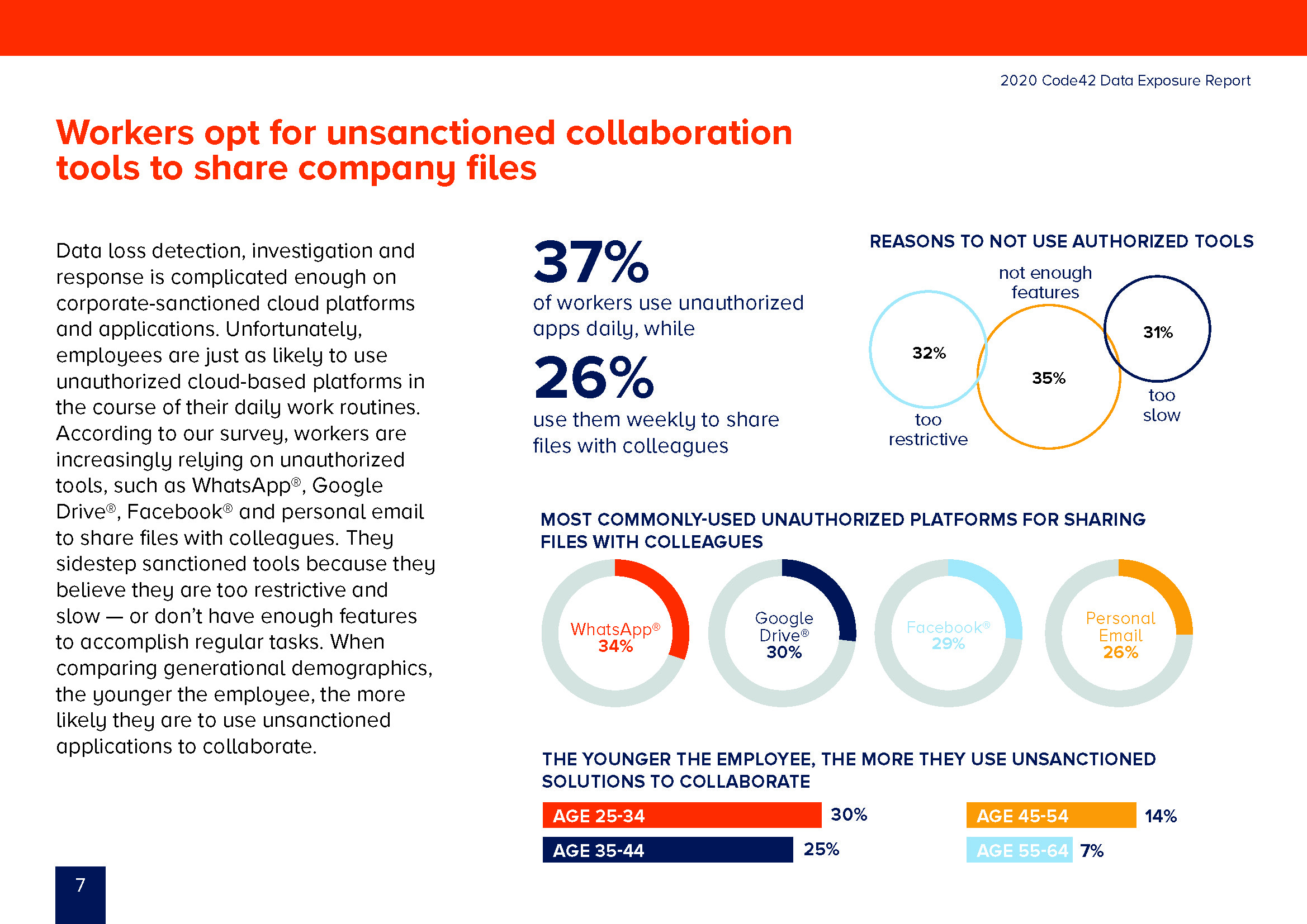
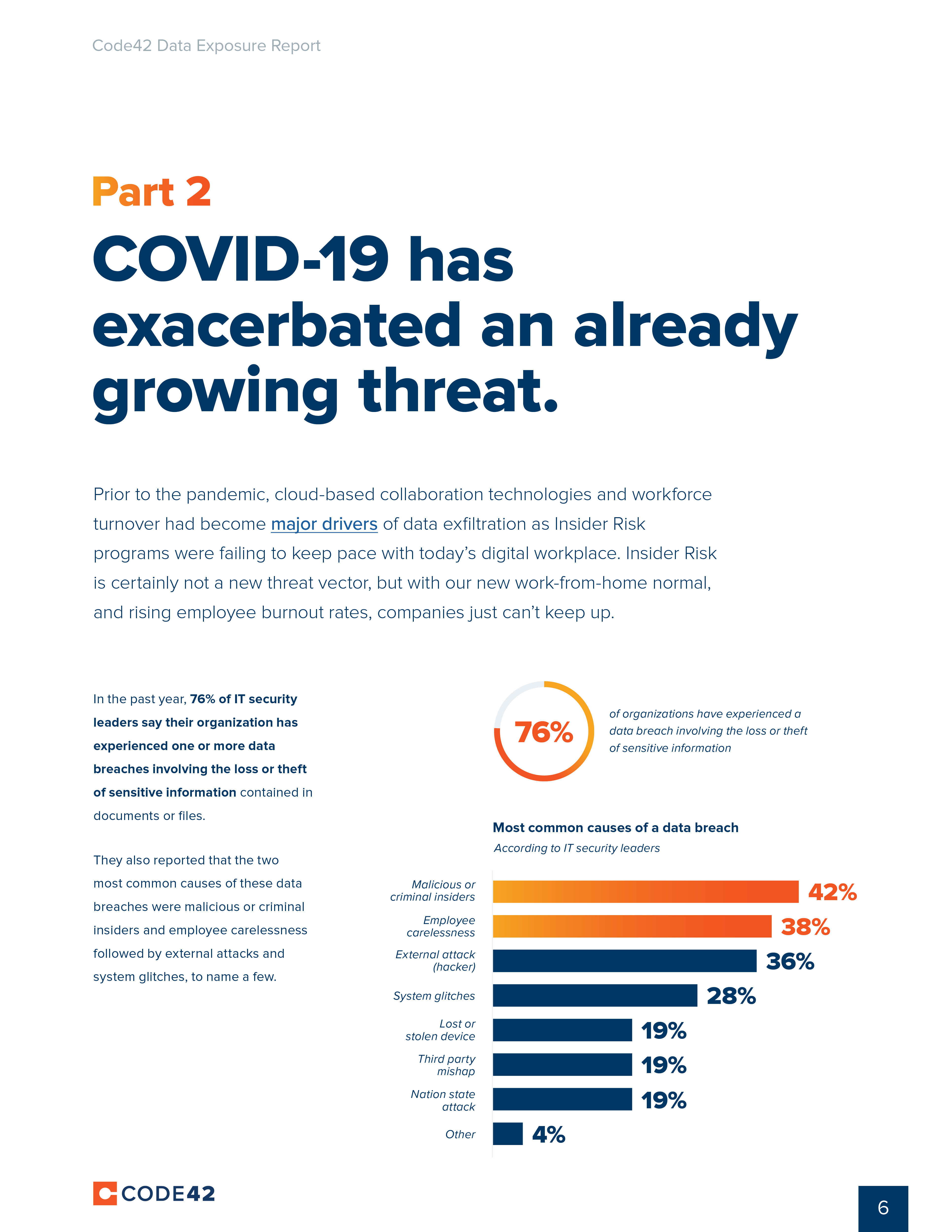
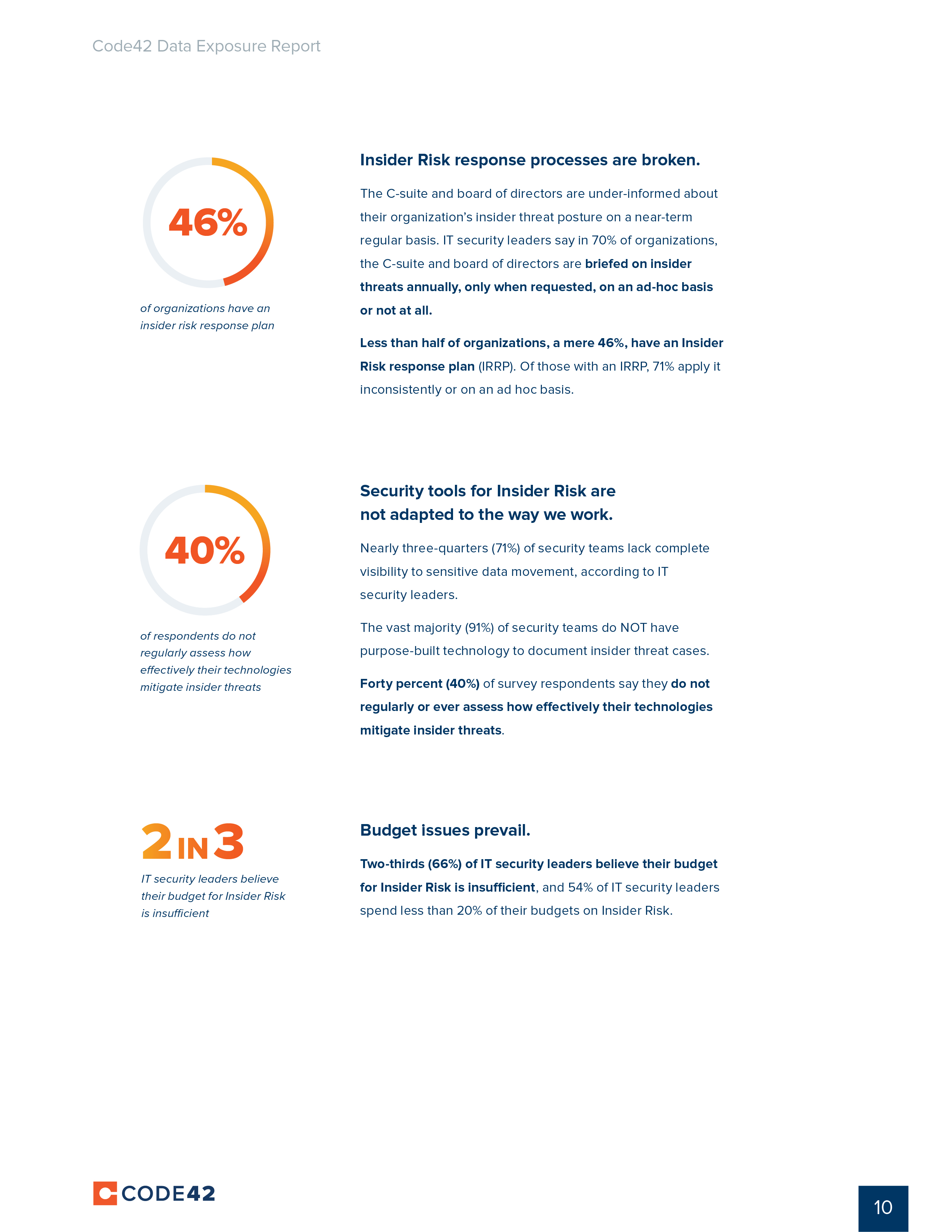
Data visualizations form the crux of the report visual content, so it was important to establish a clear visual style that could be applied consistently throughout the document. For bar and pie charts, we used the orange gradient style to highlight the most important data points. More elaborate visuals, like the data breach calendar shown below, help contextualize report findings.


The final report design helps position Code42 as an expert voice in data security. The modern, clean aesthetic contributes to the impression that Code42 is a trusted partner with a finger on the pulse of the current security landscape.


In addition to the 15-page report, deliverables included a series of static web graphics to tease the report on Code42’s website and a series of animated chart graphics designed to promote the report across Code42’s social channels.
Agency: Highwire
Client: Code42
Design Lead: Sarah Dean
Client Lead: Sarah Koniniec
Design Support: Lauren Bishop
Animation: Lauren Bishop